THE GOAL
• Design an app to deliver evidence-based writing instruction to K-6 students.
• Encourage self-regulation skills in students.
• Create a flexible system that can be used with or without an instructor (to accommodate for home-schooled students).
POWER Cycle Writing Experience
• Guides young students through a self-regulated writing program.
• Provides structure through both teacher input and the program itself.
The POWER Cycle:
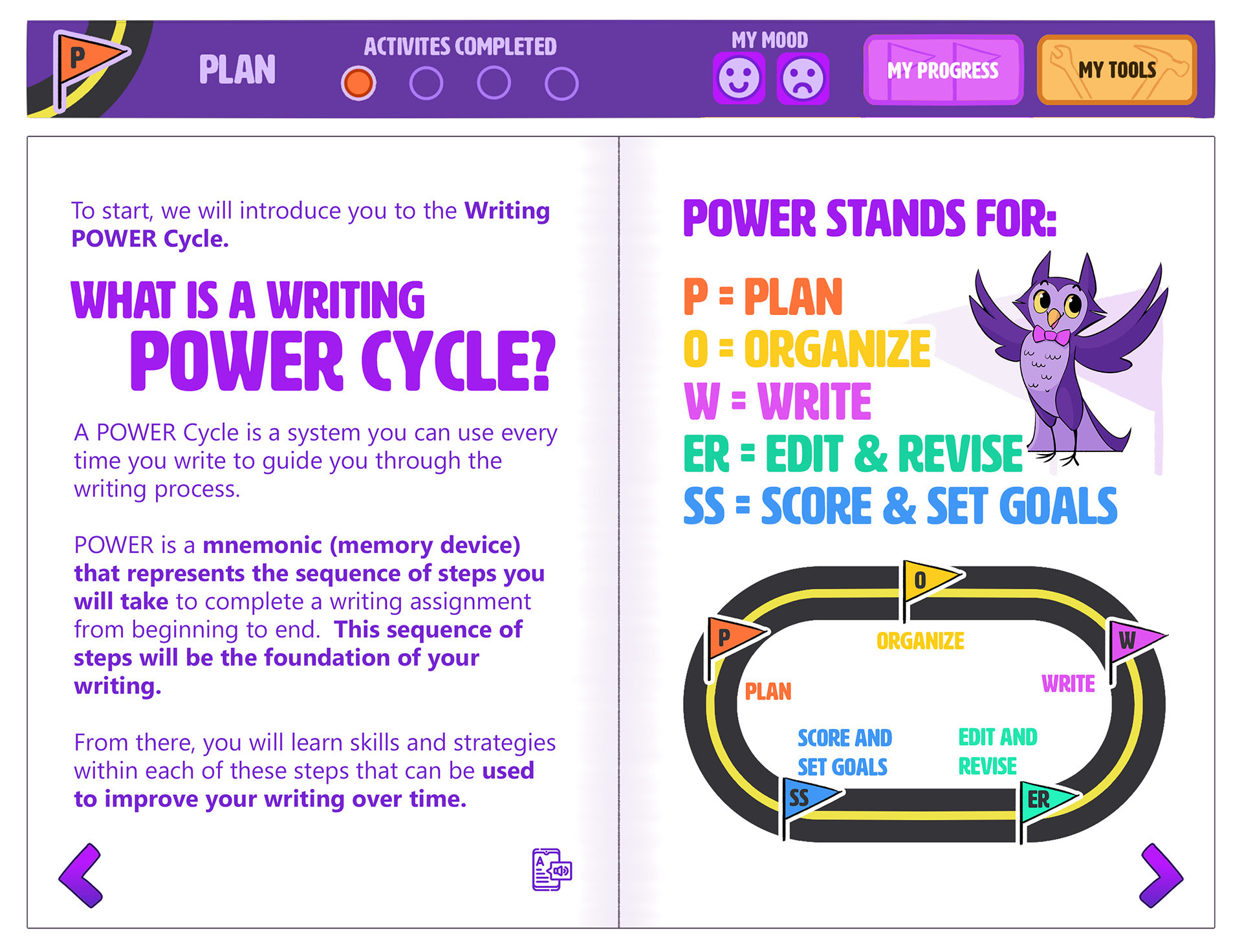
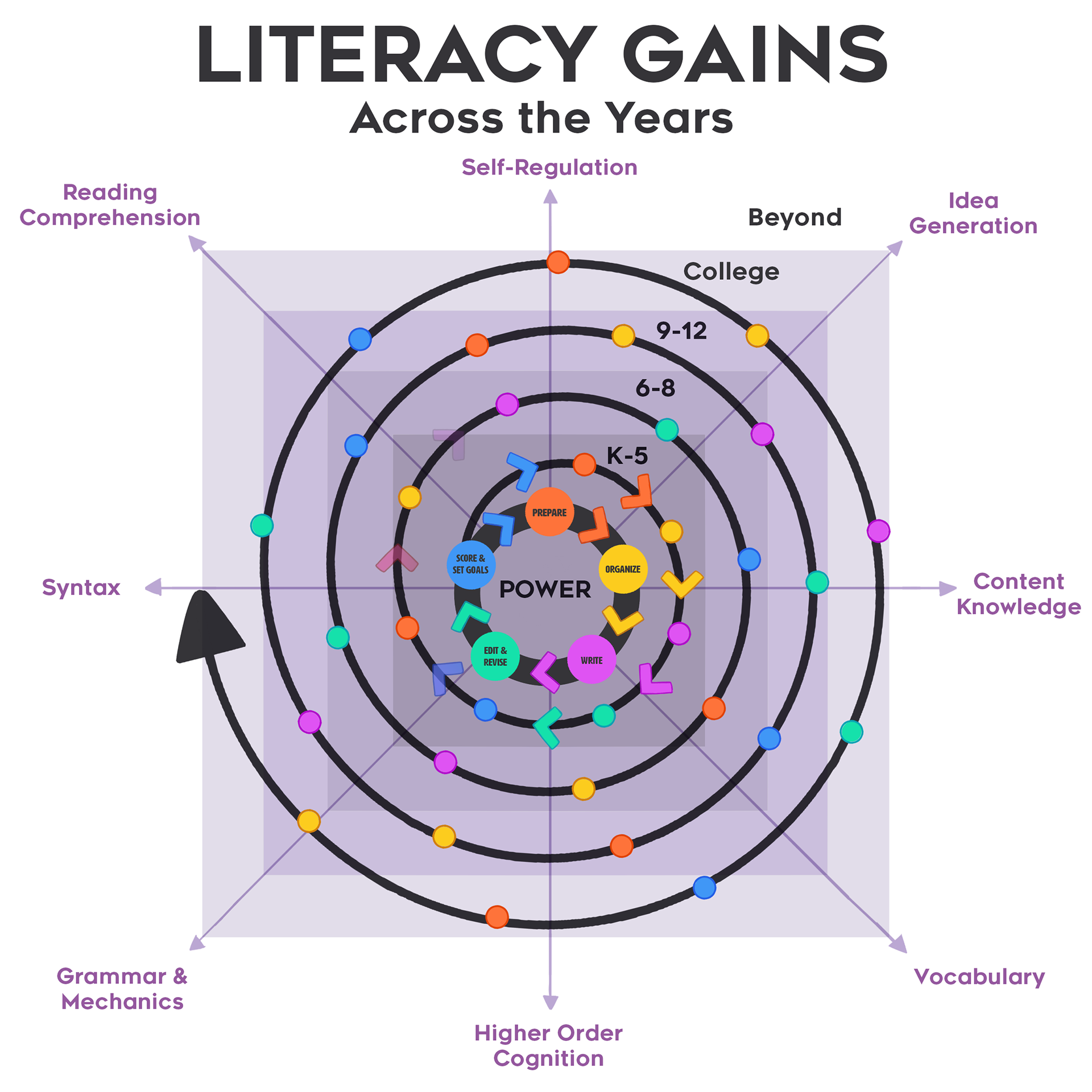
Plan, Organize, Write, Edit & Revise, and Score!
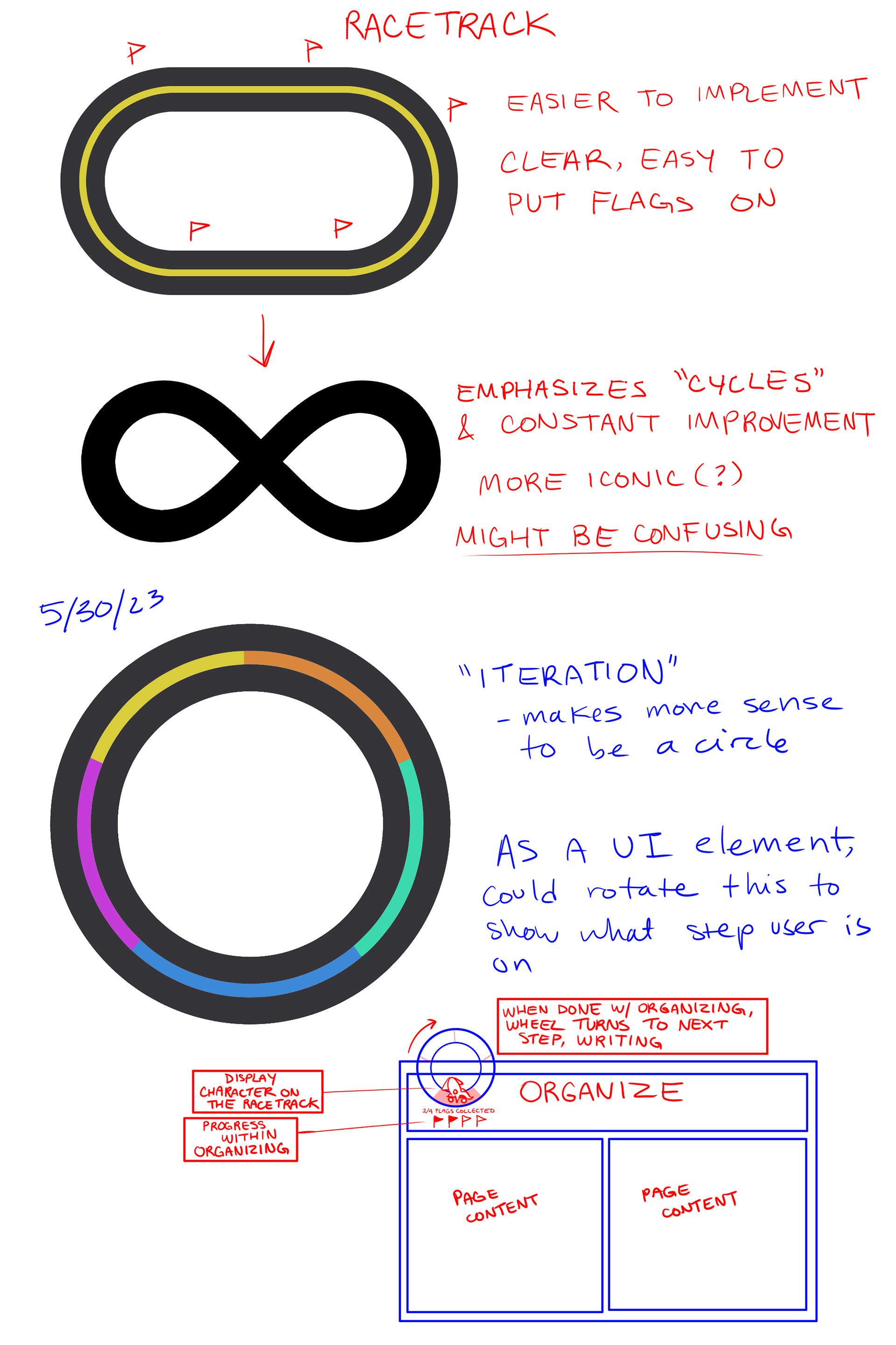
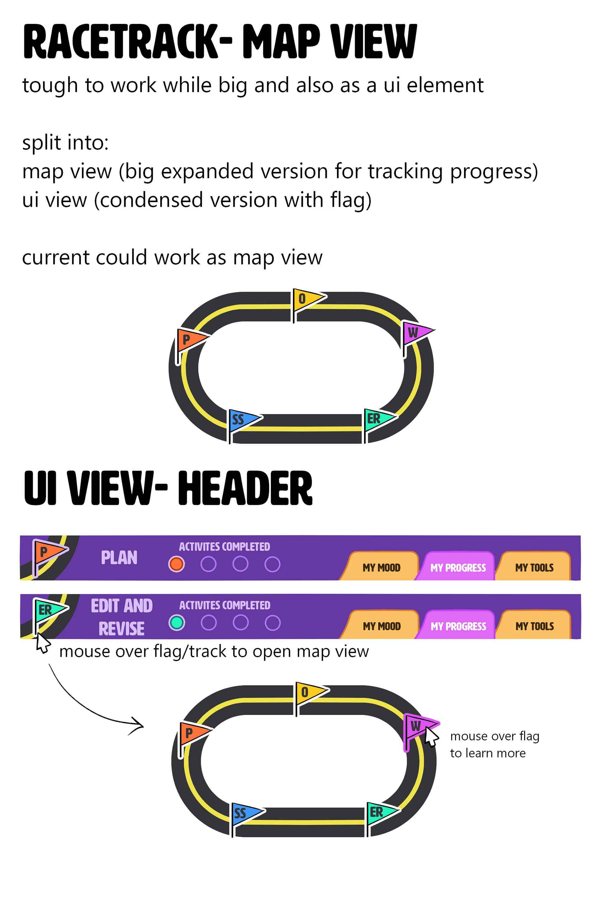
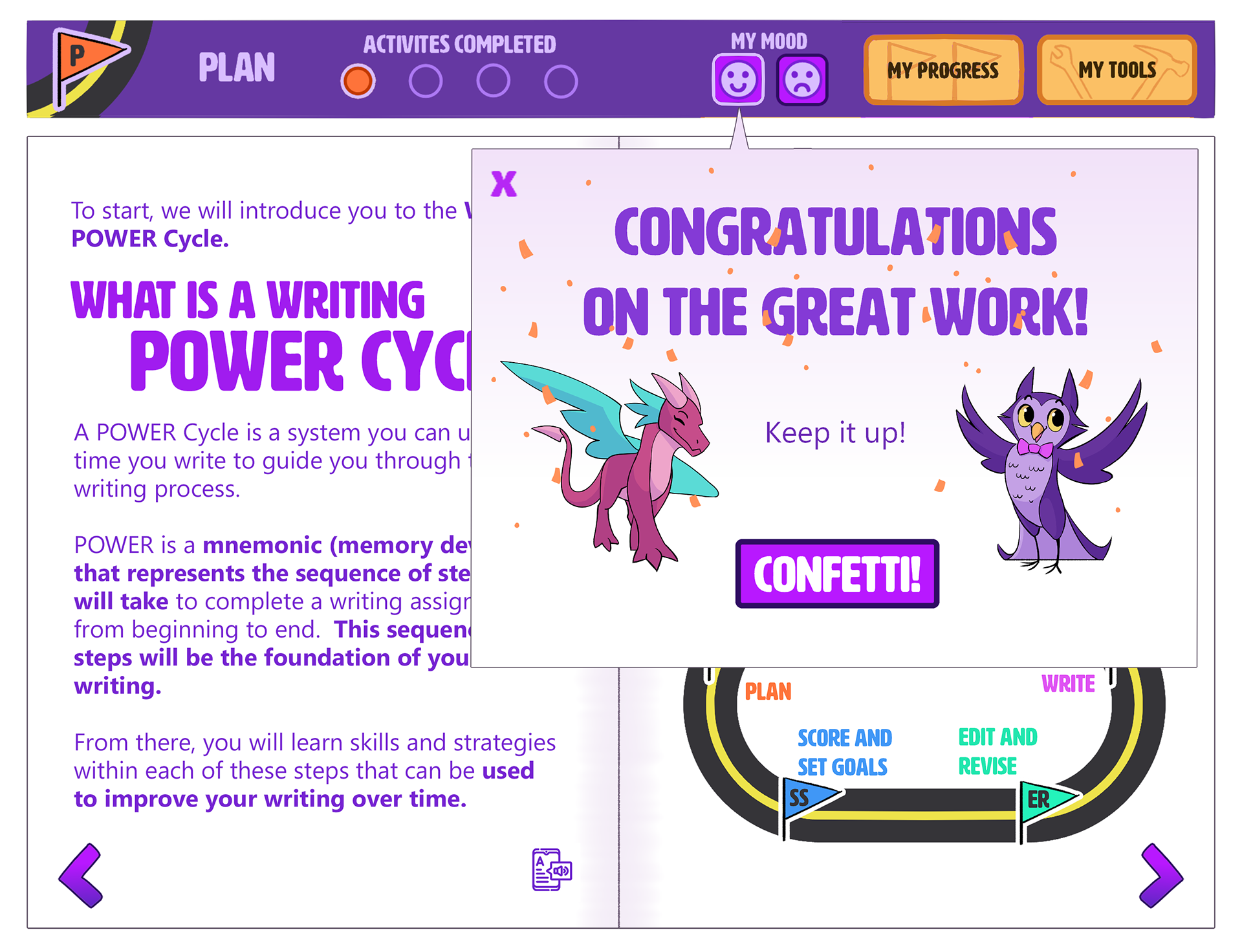
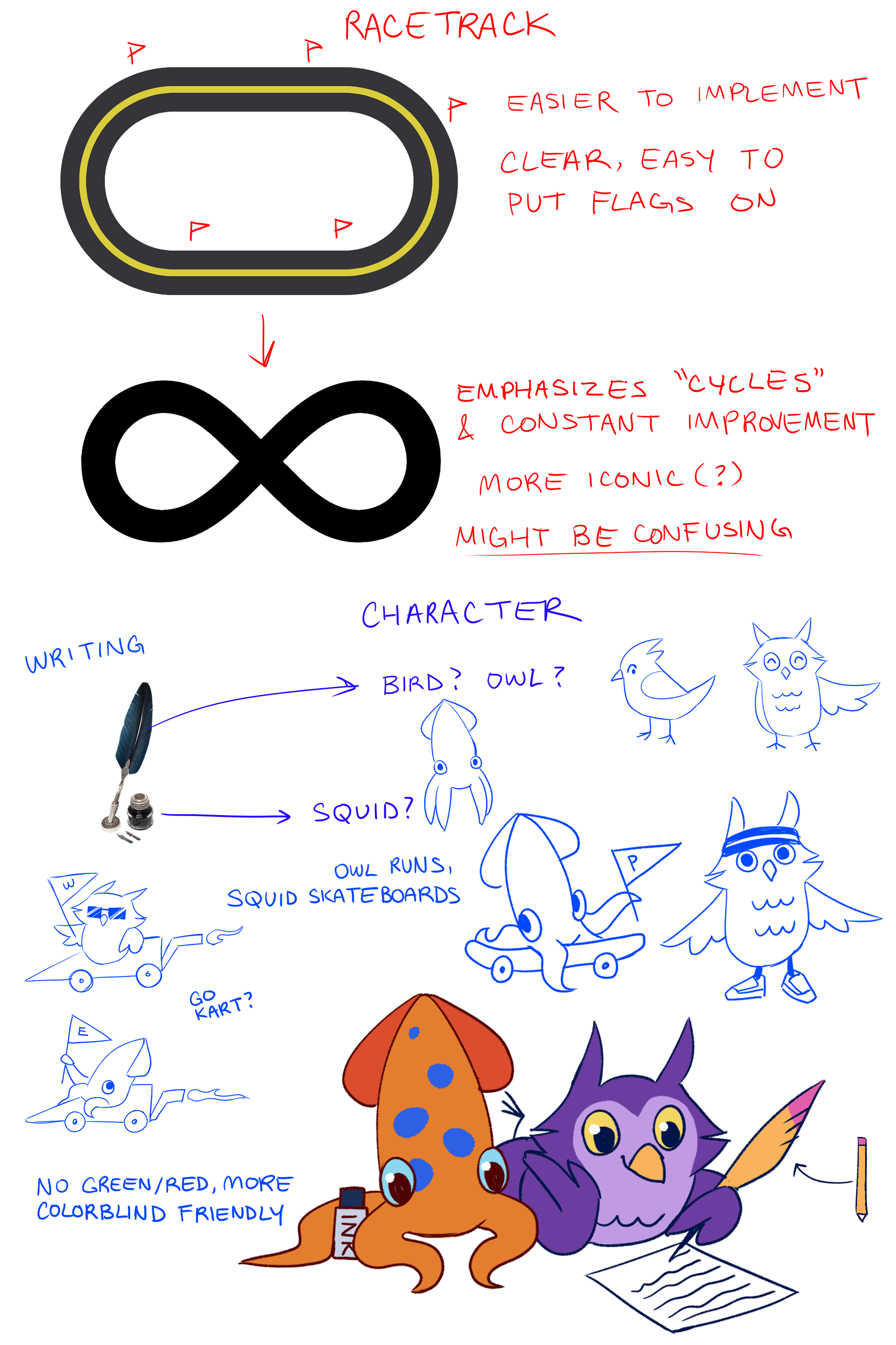
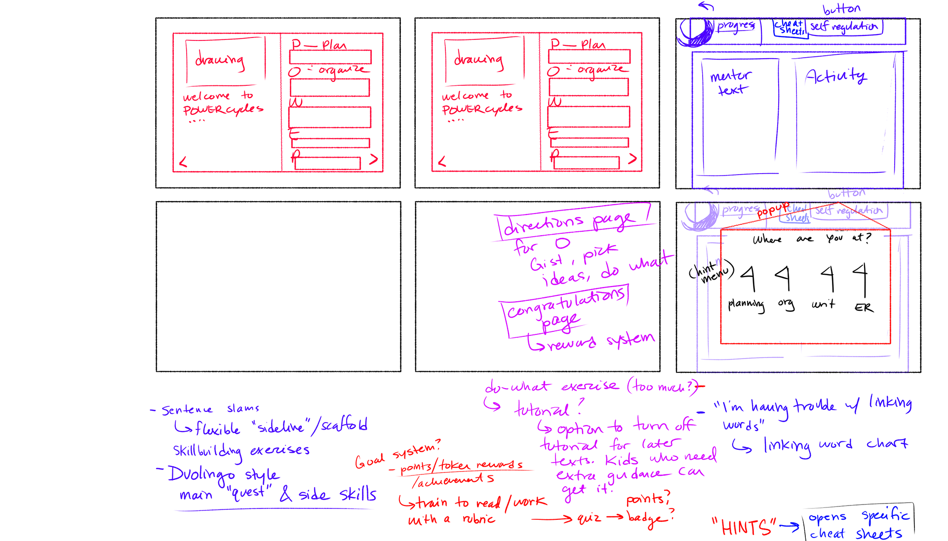
• The in-app visual is modeled after a race track to appeal to younger students.
• Each stage of the cycle is represented by a color-coded flag, so that students are able to clearly tell what stage of the assignment they're on.

Self-Regulation Tools
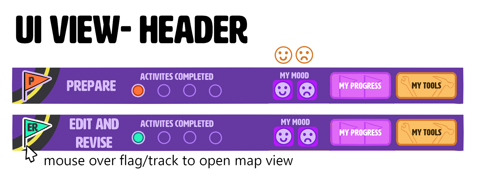
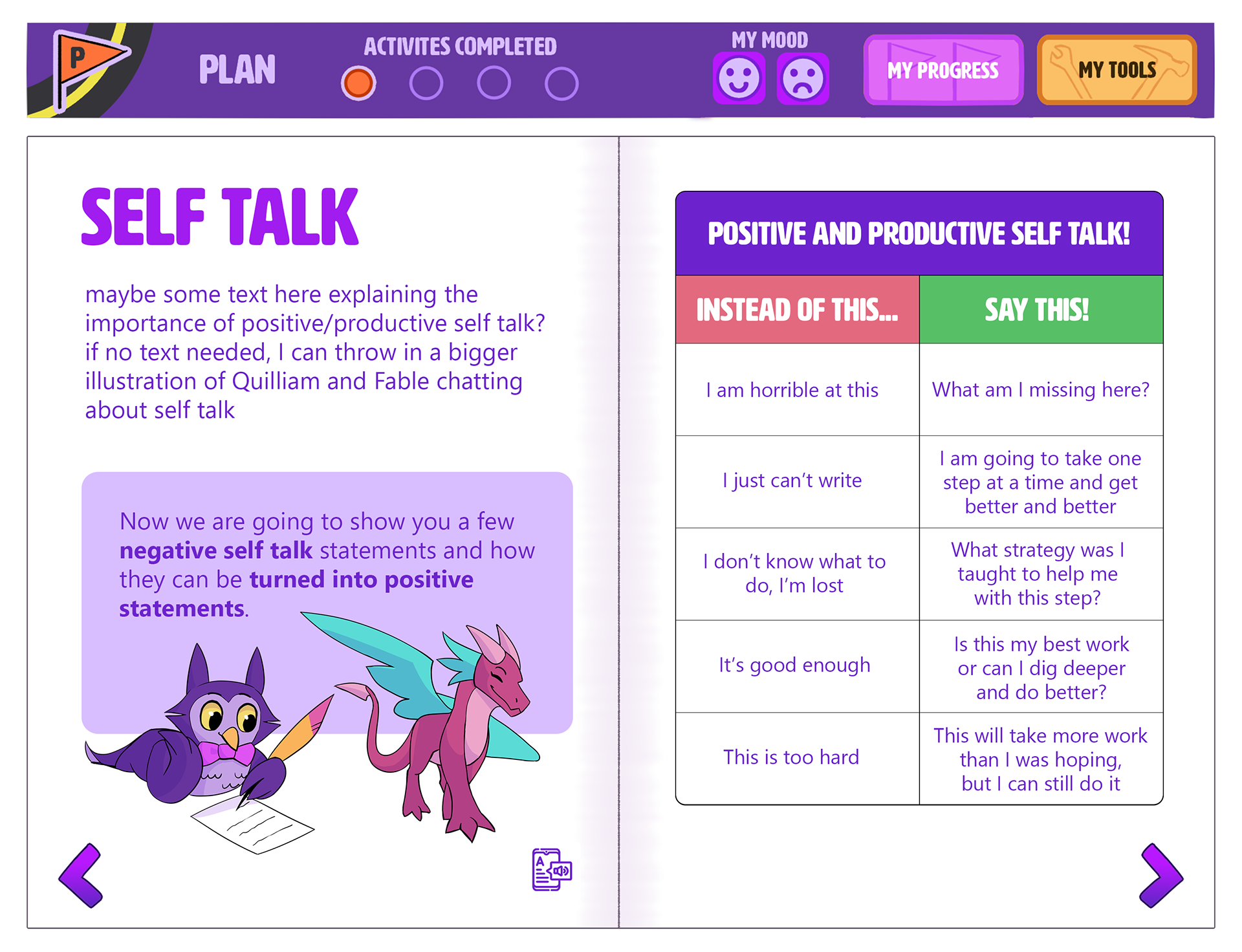
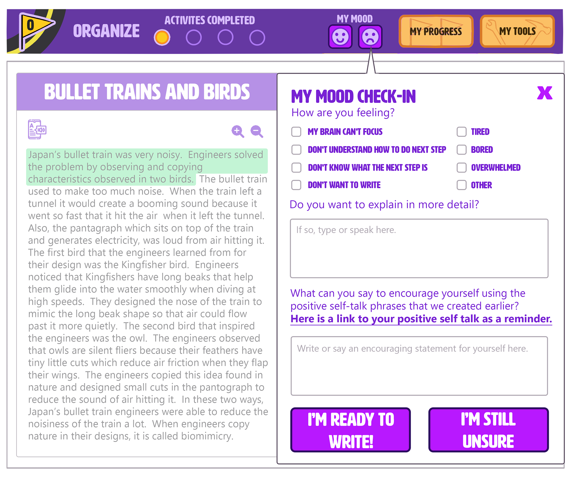
• Instruction is easily adjusted to accommodate for student frustration— reporting "My Mood"
• Easy integration for teacher instruction and support.
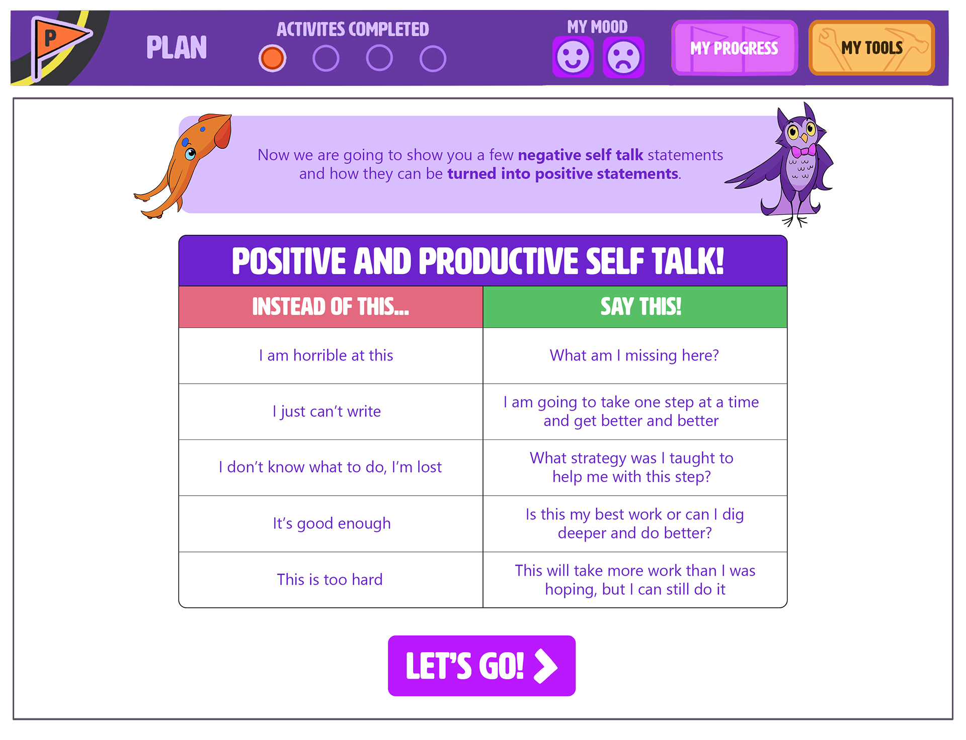
My Mood
• "My Mood" is the central hub for self-reporting.
• Clicking the happy or sad faces would open dialog windows to offer guidance on navigating frustration or confusion.
• "My Mood Check-In" could be further iterated to make the interface simpler and more kid-friendly.
Character Concept Sheets
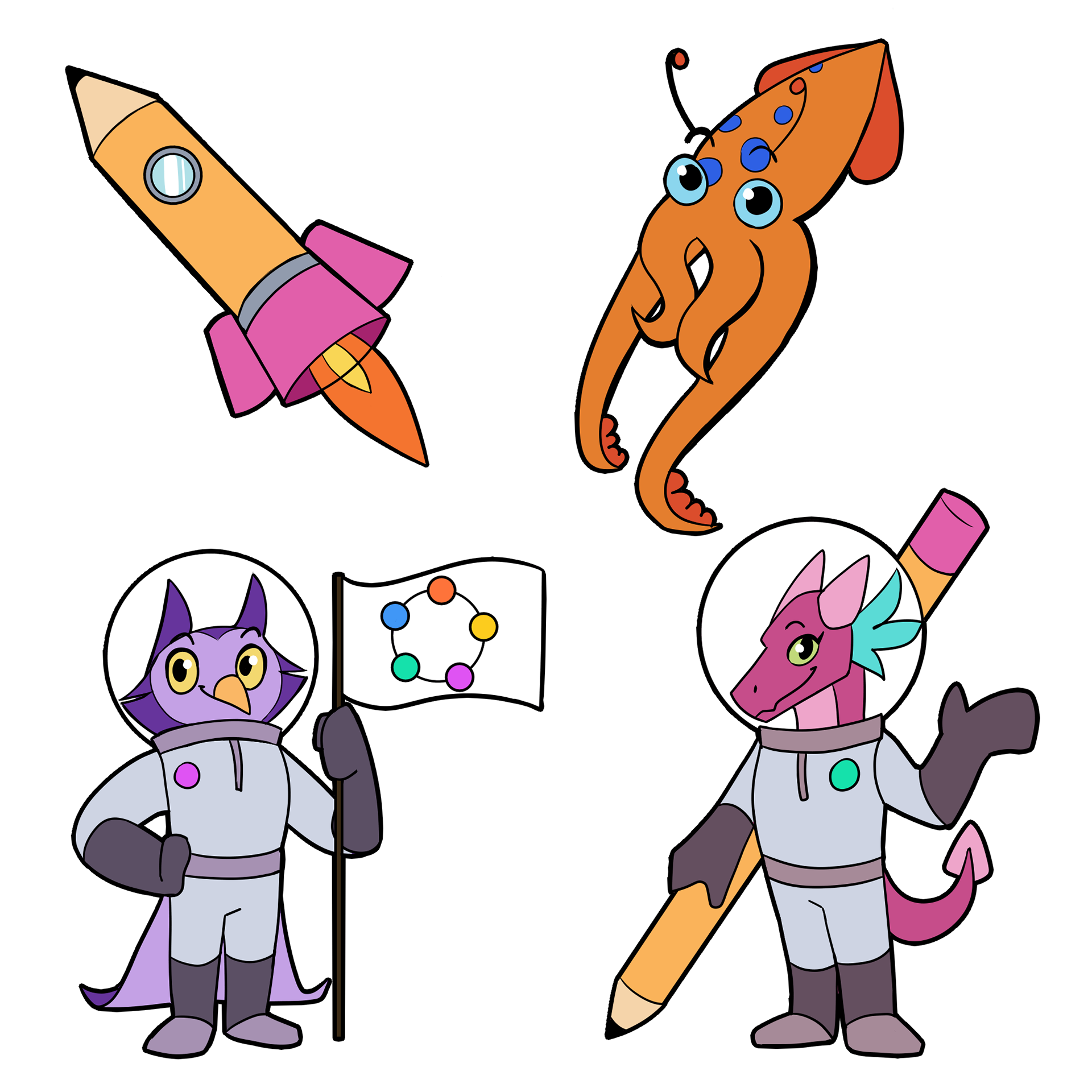
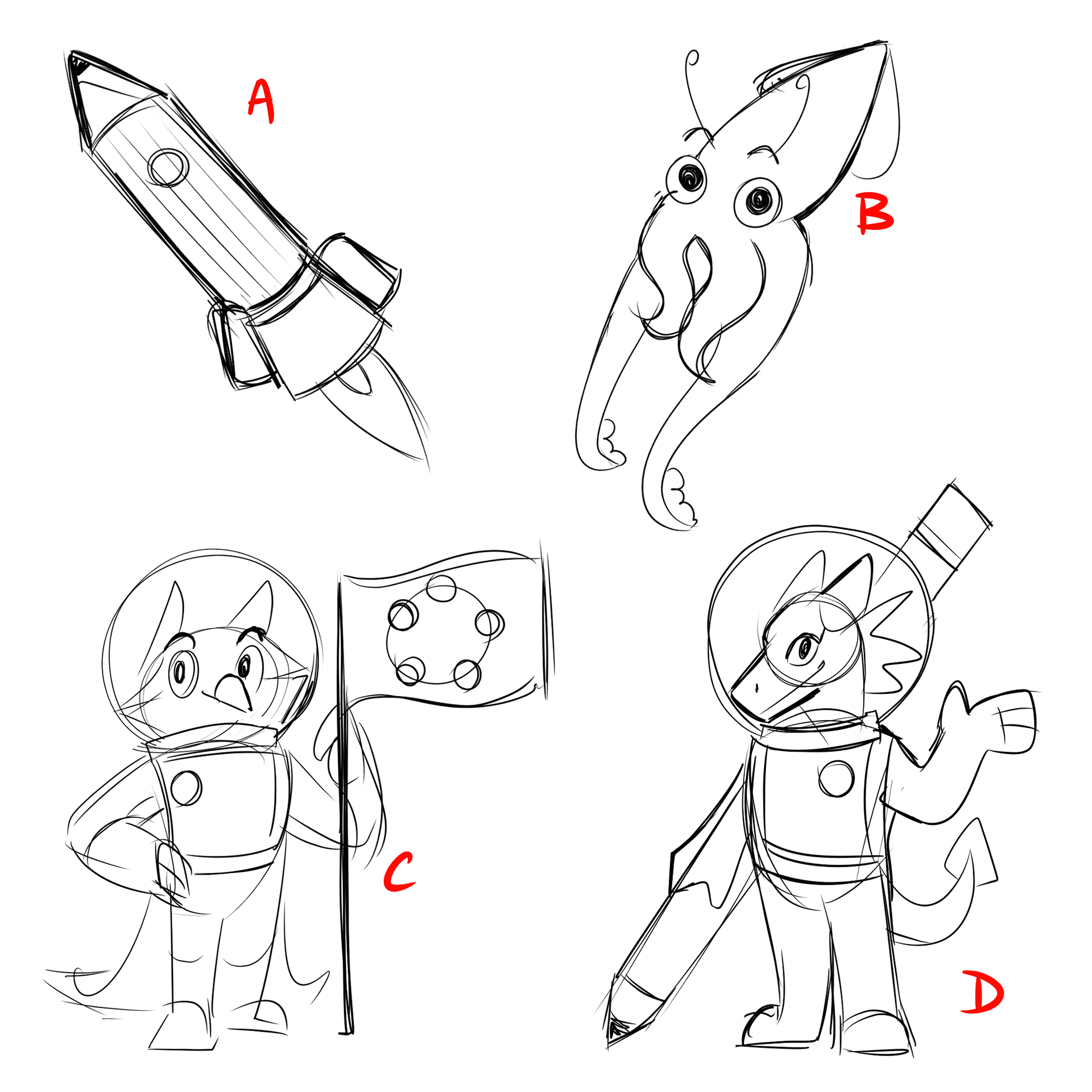
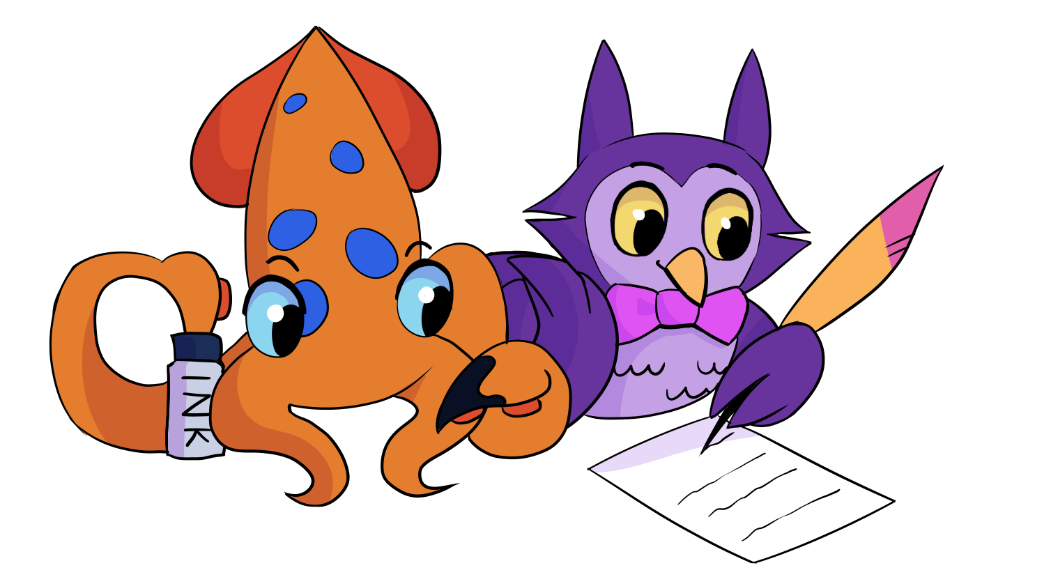
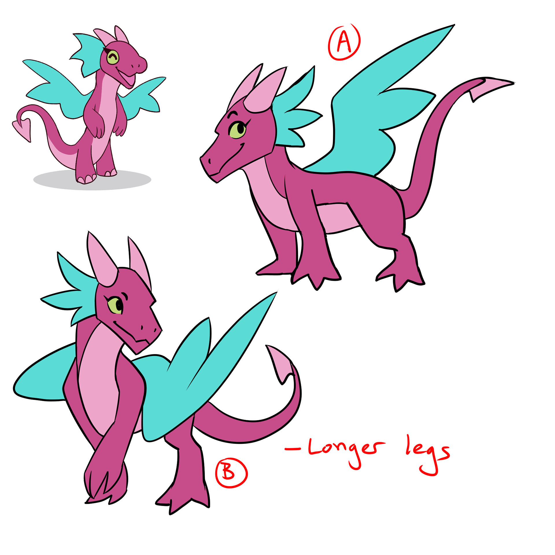
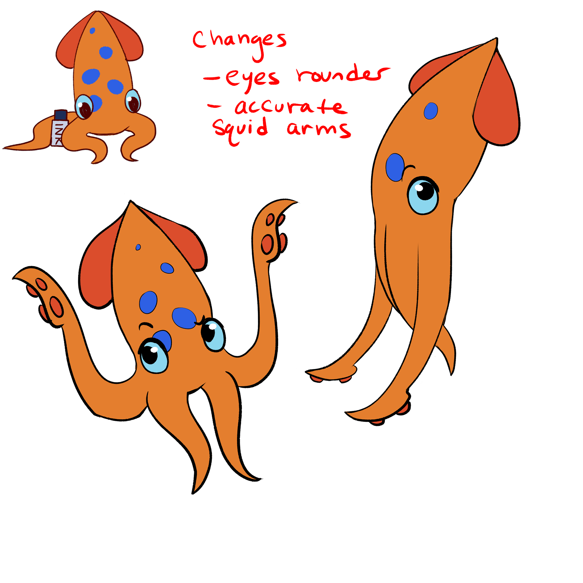
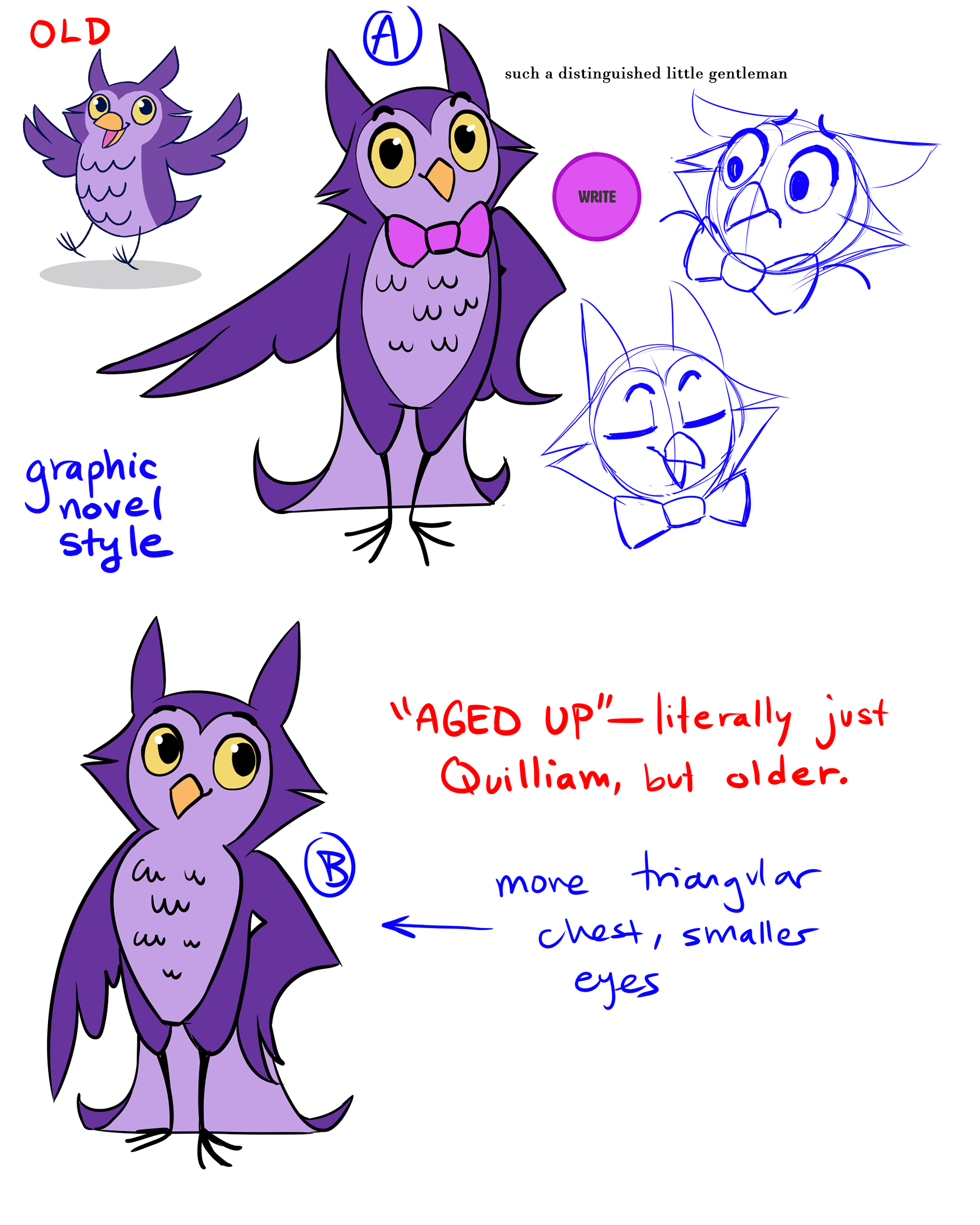
I created 3 cartoon characters to guide students through the writing program:
Quilliam (the owl), Inky (the squid), and Fable (the dragon)
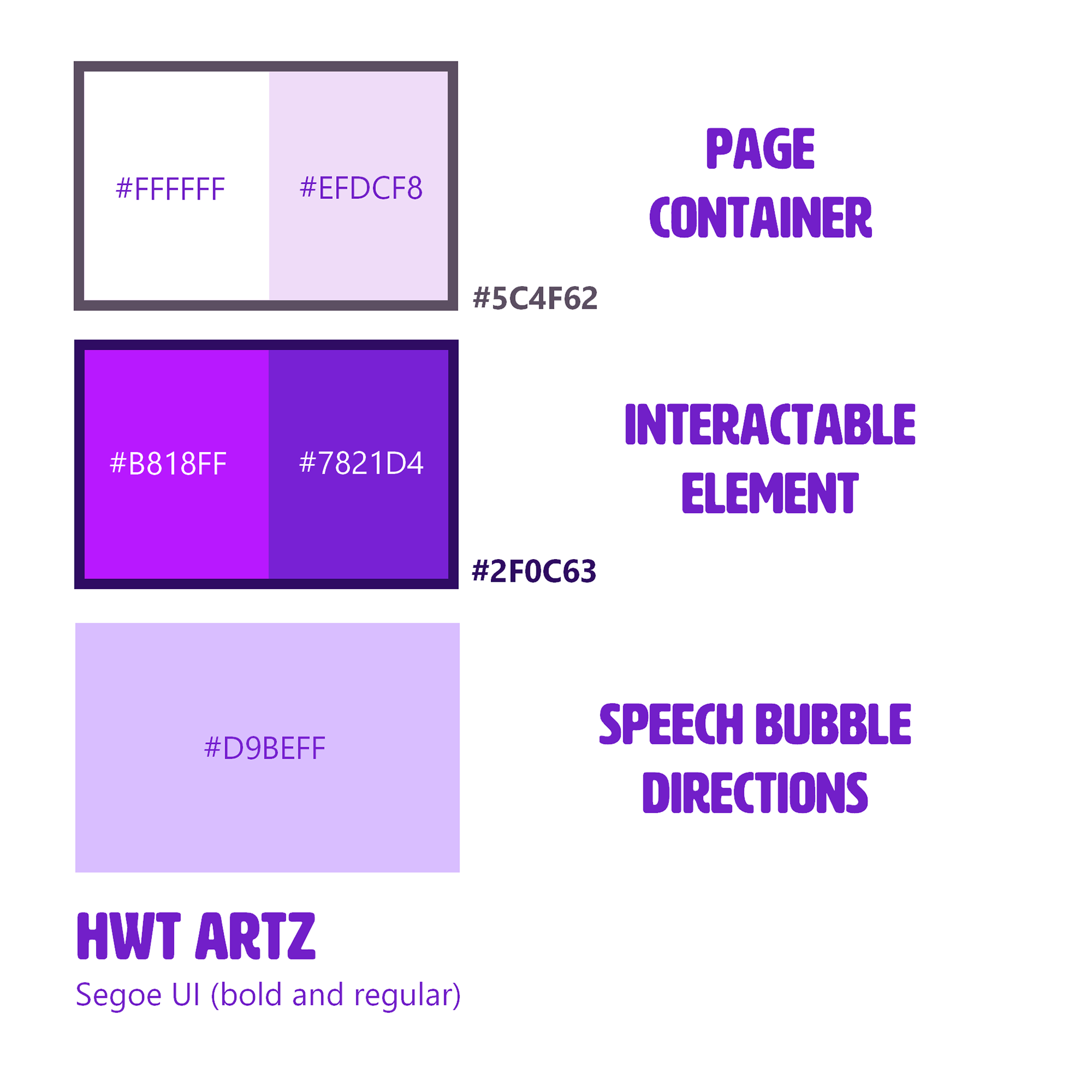
Logo and Branding Exploration
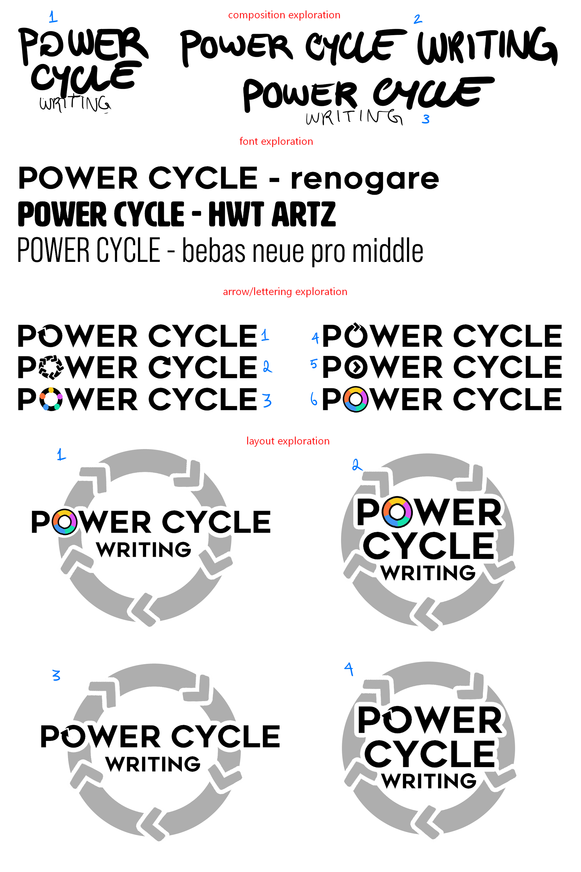
This was done towards the end of the summer, so there wasn't as much time to explore the logo. We tried to aim for a hand-written, fun classroom feeling.
