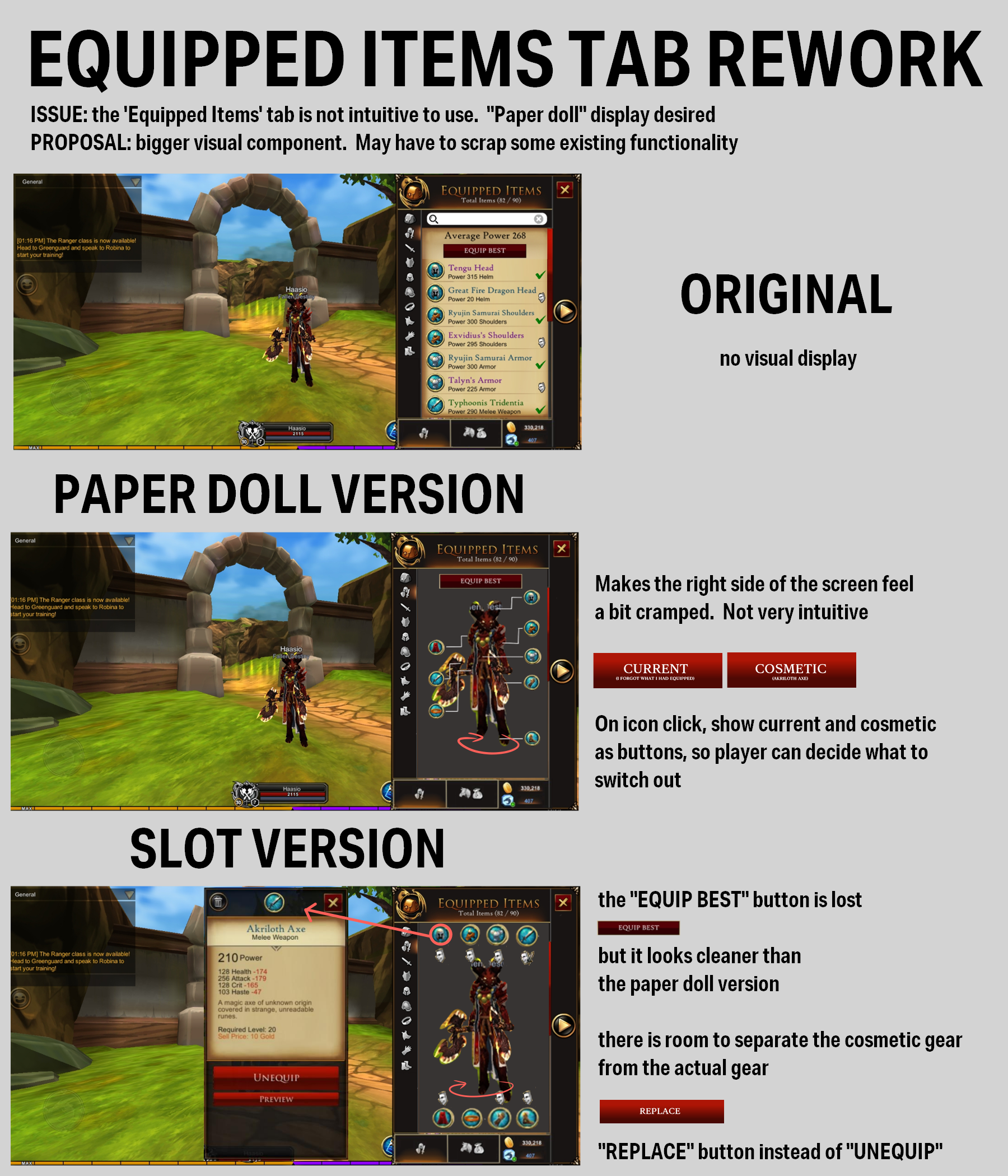
Old UI is Too Confusing!
In 2020, while playing AdventureQuest 3d, I noticed 2 issues with the user interface:
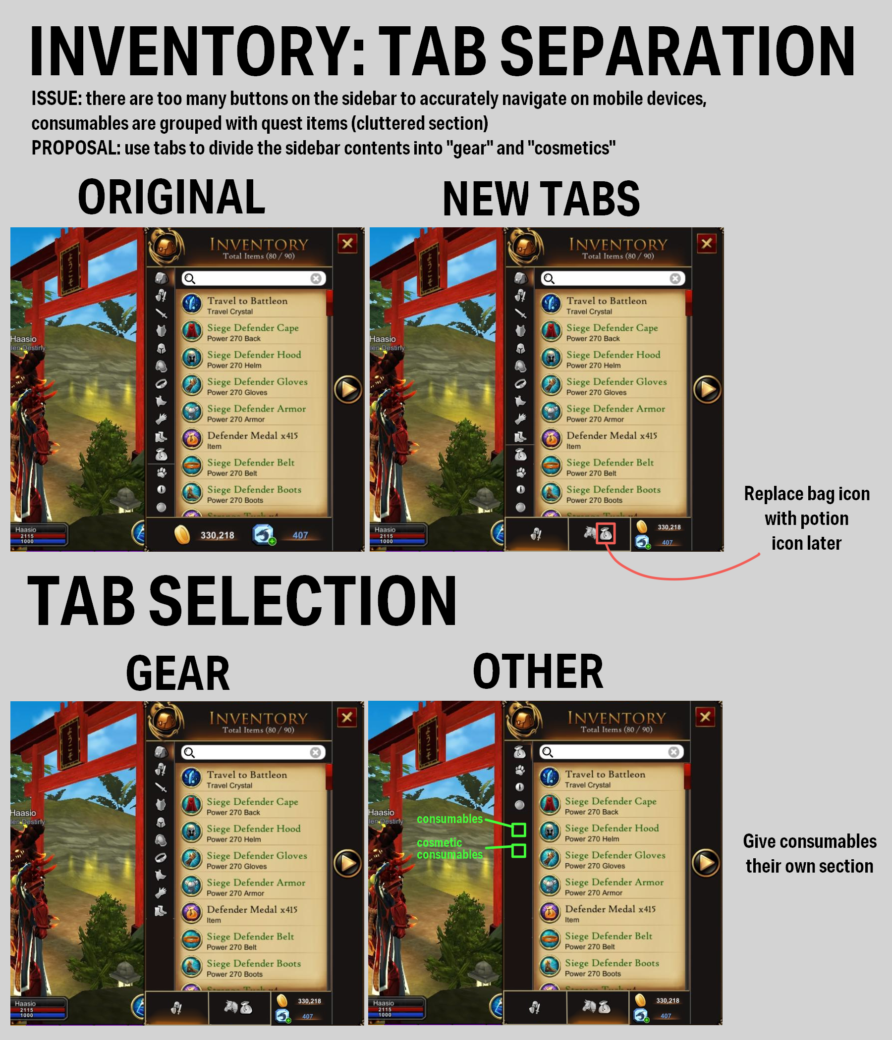
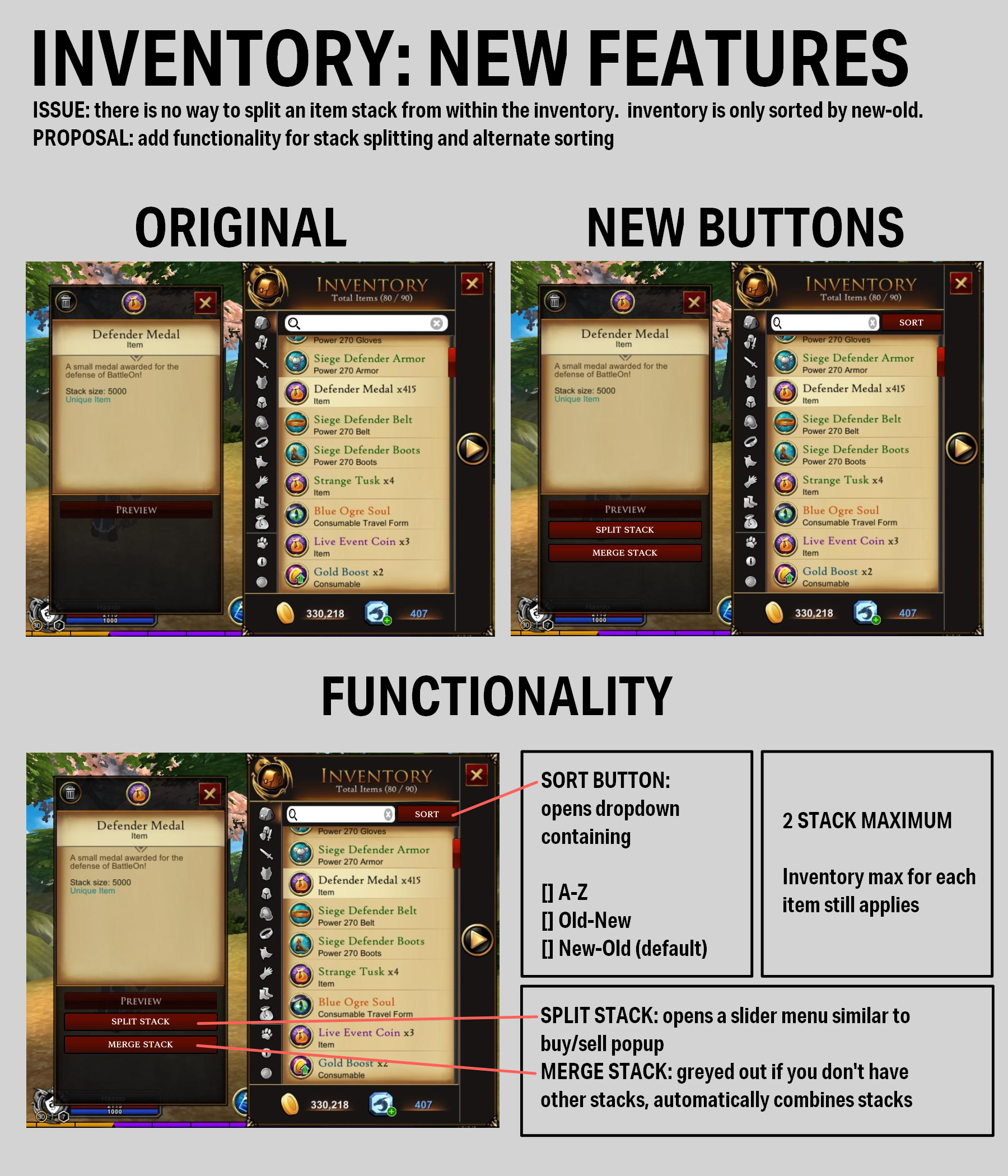
• Inventory navigation clutter. Some tabs were redundant, and others were too hard to find.
• Too many item icons are reused. This leads to confusion when the text is not visible.
So I contacted the developers and proposed a set of solutions.
Problem 1: Navigation Clutter
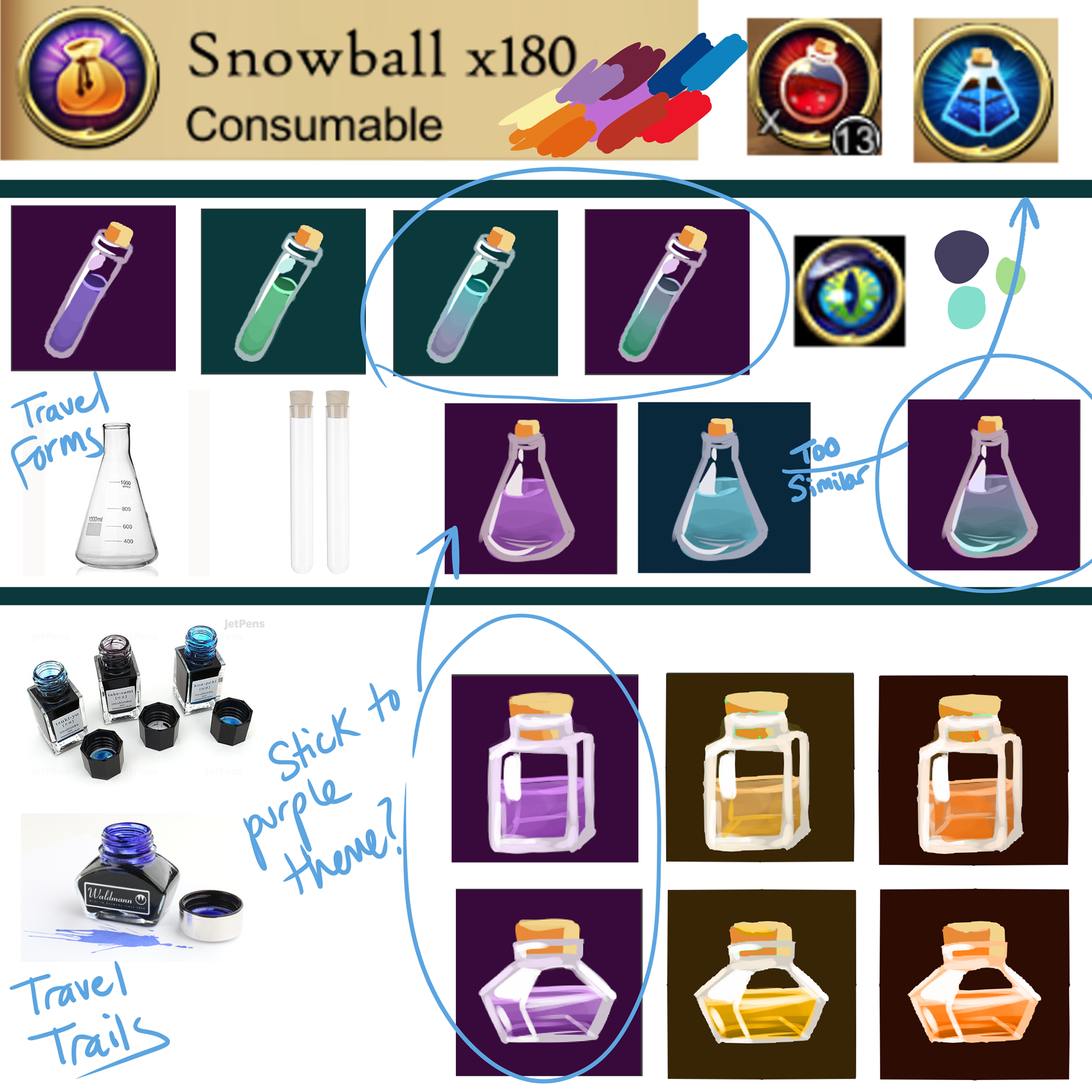
Problem 2: Need More Icons
...So I made more
These were created because there was not enough existing item icons to accurately tell what item you were using, especially when there was no text visible.